This information is based on a Slide Design to enhance the overall purpose of an ad campaign. For example, if we used this ad below and look at some of the decisions and principles that were used to enhance this campaign.
Here we see the typography sans serif, which today, comes in many names depending on where you get it from. With the “Adobe kit”, it is called Industry Fort Foundry. The type having rounded body and crisp finish at the ends and a higher type point is very clear to see and read for the audience. This Type is carried throughout this design.
The font, “logo of the company” and Drone, are placed at the forefront of the ad, to keep the design cohesive and balance’. This gives the audience the ad information and what it is all about. The type is found at the top right aligned and again at the bottom left center aligned.
The blue and white in the logo, type, and background are also carried throughout the design and gives balance. There is a slight variation of blues to draw the audience attention to each field of the design. The light blue background gives the impression the Drone is flying in the sky.
The new ad for the overall ad campaign.
The new ad for the overall ad campaign.
Here we can see that the design layout is pretty much the same with a slight variation to draw the audience quick glance of the ad and bring home the Campaigns ad agenda. The Sans Serif, industry Fort Foundry, is again carried throughout the type usage but with a thinner point font. The cohesiveness is still within the Campaign choice and usage of blue and white for Color.
The new ad for the overall ad campaign.
In conclusion: there is an understanding first of who and why there is a need for any ad campaign design. Every decision is based on the principles of Understanding, Design, Typography, and Color. Any Company and/or students would hold a high integrity that would come from their first impression of such an ad campaign.
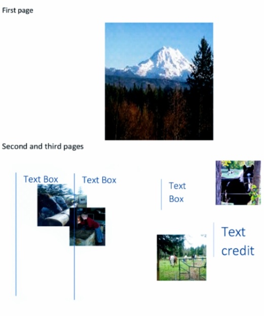
I was to find an article and use InDesign from Adobe to create a magazine layout using the pictures I have taken to render visual aid to the story in their proper place using: 3 Pages; 1 Spread, 8.375” x 10.875” page size, 2+ Column Layout, Break the article up with 3+ headings/subheadings, 1+ Pull Quote(s), 1+ Word Wrap (image) The target audience is one that would be reading the article out of a magazine. My main design decisions are based on a process of 3 design ideas put on paper with the article type in place to see what the end result will be.
Below is one of my example designs with my photos.
Design and photos by April Arnott Article by: Elder V. Dallas Merrell of the Seventy
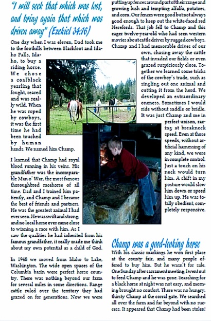
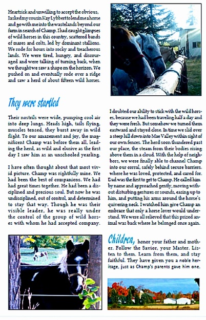
Next, it is time to decide what typeface will be use for the title, subheadings and body of the Magazine article. This process is about finding two different typeface that work well together but have contrast that work well together. I chose to use: Franklin Goth Sans, title and for the body font and ar-dlanca ornament, for the heading and subheadings. This will lend the contrast needed for the eye to flow over the article and its parts to draw the readings attention to what the parts of the whole are all about.
Next is the placement of the photos within the article. The visual of the photos within the article gives way to photography skills that are needed. Notice the flow it gives to the reader to enhance the story.
Next, the decision on color scheme and strategy: I chose darker blue for the title and sky blue for the heading and subheading, last color is black for the body text. The color placement sets the overall tone of cohesiveness of the design. Notice how the subheadings are the same color as the sky in the photo on the first page. The color invites the reader to the whole piece that is designed in its entirety, within these next three pages below.
Page 1
Design and Photos by April Arnott Artical By Elder V. Dallas Merrell of the Seventy
Page 2.
Design and Photos by April Arnott Artical By Elder V. Dallas Merrell of the Seventy
Page 3.
Design and Photos by April Arnott Artical By Elder V. Dallas Merrell of the Seventy
In conclusion, this design was put together with thought, a process of principles of design with an end-result that I can truly say I enjoyed putting together. Clearly each section of design, typography, color and photography skills play a part in the overall article and leaves the reader with a clear story that they will not soon forget.
Article by: Elder V. Dallas Merrell of the Seventy
The lines here bring our view point to the lower right side where we see the lady walking, this is the first point. Notice how the lady is opposite the column on the left, it keeps out vision focused within the story the picture is telling us about. This brings balance to the photo. We end up interested in where she is going in the view of her surroundings.
This painting by Mr. Hopper gives us another example of Rule of Thirds. Here we see the bottom of the building is on the lower left point and the center of the bar-table is on the lower right point. The picture is telling our eye where to go and places the people to the right of the painting. There is depth and contrast of the inside of the building and the out side. What contrasts the setup of Rule of Thirds this gives us to the story the painter is conveying.
By April Arnott “In the Park”
Rule of Thirds and Leading Lines
Here is a picture at the local park where I live. This photo has a view with Rule of Thirds in-red. At the lower left a man is siting in the pavilion and the lady is on the lower right. This also brings balance to the picture and tells us a story. It leads the viewer to think they are going to have a picnic in the park today.
By Valerie Jardan “Paris” //http://www.mydigitalphotography.net/category/featured/
Leading Line
The lines in this part of Valerie’s photo show where the eye is led. This aids us in thought and where she may be going. Our eye is led down the walkway, narrowing our view to a doorway. We are being lead down a path and left with the question to where it may be going.
Here we can see Jim Zuckerman’s photo of flowers growing in rows, show definitely he is using Leading Lines. We then find they lead to a windmill at the center of the photo. Notice that the lines are out and going into the picture. The composition keeps us engaged in all that wonderful color with a destination in view.
By April Arnott “Bridge”
Leading Lines
This photo was taken in the city park which uses Leading Lines going across the bridge. Again our eye is drawn to the other side of the bridge with the composition of lifting up and over the water to the other side of another adventure.
By April Arnott “House and Bridge”
Leading Lines
Leading Lines are displayed here from the side of the photo, across the water and the bridge. There are several things I like about this photo. One, it does have the Leading Lines but it also has the Leading Lines in the grass going into the photo and across the the bridge even with the top of the house. Then you can see the Rule of Thirds with the house in the upper right corner point and the water beginning at the lower left corner. The composition of this photo has many things to keep the eye flowing and interested.
Notice how PNile used the depth of the front of this image to bring it forward out from the background. The Depth of Field aids our eye to focus on the story being told in this photo. The one thing I love about this image is there are also lines where the items are sitting and the top of the cups. The water brings a dramatic effect to keep the interest in such a simple photo.
By April Arnott “Pastels”
Depth of Field
If you have looked at any of my other posts, you would have seen that I love art. I can use just about anything to create something that I have found people like and are willing to own. Here I am still interested in hands on and have lots to go around so what better thing to show Depth of Field then pastels. Here you can see that the color in the foreground is focused and the background is out of focus, drawing the eye to the clear 123 art-set on the greenest of green pastel in an area full of colors. Notice how it looks like they are never ending as they rise to the top of the photo.
By April Arnott Colored Pencils
Depth of Field
This photo is almost the same as the other but you can see they are pointed downward and across. The focus is on the blueish purple colored pencil as the rest are a representation of pencils in varying colors, going on and on. To me it looks like that one is begging to be used and the rest will follow. The composition of this photo would be well used as a way to draw the eye to an advertisement for art supplies or a letter head for its company.
In conclusion, the natural light gives a balance to the composition of any photo. It leads our eye through all the elements with it’t highs and shadows dancing over the surface of any object. The light combined with the placement of an object in the image has a name and can lend a hand to view our world in many different ways. Whether you are using Rule of Thirds, Leading Lines, Depth of Field or using the talents the Lord gave us, we can have fun with many ways to take photos for our compositions.
Maine is making a big statement to grab attention with this colorful art to draw interest within the heading on the postcard. This postcard has the use of typeface Modern which is,”cold but elegant look”. It’s set in,” strong thick/thin transition” lines and gives the, “effect” that is “called dazzling” ( The non-Designer’s Design Book Fourth Edition By Robin Williams).
By Maine
Sans Serif Typeface & Maine’s Postcards
Mains Postcards are, “monowieght and virtually no visible thick/thin transitions,” with the use of Sans Serif typeface in the body. This typeface can use a,”wide variety of weights and options increase for creating,” just the right look for the attentions ( The non-Designer’s Design Book Fourth Edition By Robin Williams) .
In Concussion, the choice of placing the painting image to the left and the Type right on the page and left to the right side of the image is an elegant look to emphasize there is not much information needed to pull our attention to the main point that this is a piece that is worthy of display as an ad for the museum and artist.
This Artist’s ad lets her customers know what is new.
Proximity, The artist chose to highlight each heading and place it above the information related to them. The local information is located at the bottom of the page and items there are grouped together for a well balanced view of the information presented, seen below.
Alignment was justified right to separate the information about the artist from the picture of the artist on the left. Both are found at the top of the page giving it an appearance of two separate columns with a center. The information at the bottom of the page is centered and ends all the information with a location the artist can be located and supply’s that she uses. It could have worked to the right along with the other typed information but does not take away from the top and bottom lines of the page making a start and a end and everything in between. It still keeps the readers interest.
Repetition is not used much with an artist that likes to create, however, here the headings and the information type is all one size within its frame work for that information. Each painting is finished with sharp edges and appear in columns.
Contrast is shown by the letters being opposite the page color it is on. notice the blue top with white typed letters and the white background with the black typed letters. There are also contrast in the color and the paintings size and placement on the page.
Color for any artist is drawing the eye in as much as possible to invite and enjoy. Here the artist sets her paintings up with three colors of Blue, Yellow and orange that fades into reds. These colors all are opposite each other on the color wheel and work well with each other. It is even more interesting how she picked each on to compliment the other with in those color spectrum. As you can see with regards to RGB (Red, Green, and Blue) used for televisions or iPads and CMYK Cyam, Magenta, yellow, ink colors, the artist choice is also a good one because the color of the painting and its own background is very adaptable in real life and held here on a visual Media form.
In conclusion, We can see this is an ad that anyone that loves art would stop and read as well as look at the well balances elements and principles of Design and Reverse Engineering.